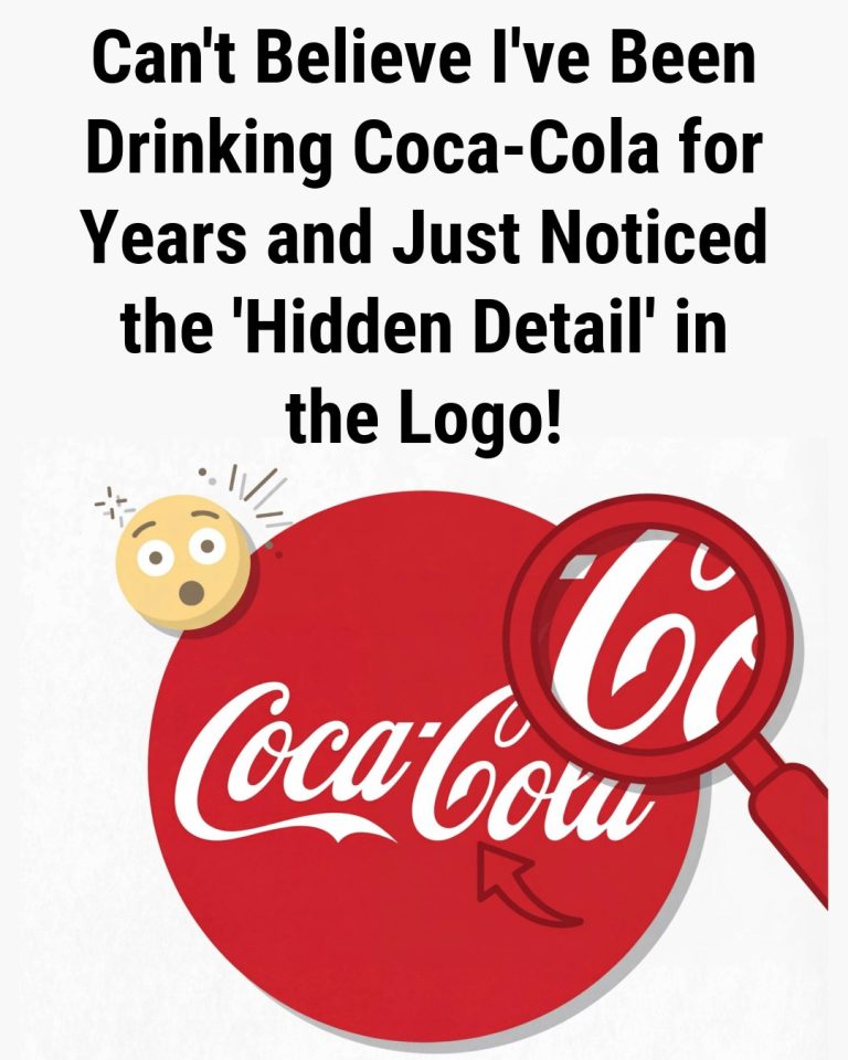
People Are Spotting a ‘Hidden Detail’ in the Coca-Cola Logo
It happens in a split second. Someone notices a detail, and the familiar logo is never quite the same again. That second “C” in the word Cola suddenly looks like more than a letter. It resembles a smile, giving the logo a warmer, friendlier feeling. Once recognized, the shape seems alive, as if the bottle…